
Since a few years back, mobile commerce (also referred to as m-commerce) has always been called the “next big thing.” As the digital marketplace moves further into advancement, we witness a progression in the face of our handy smartphones.
Today, you’ll rarely see any brand that isn’t yet accessible on mobile. Going online means being available across all devices, whether on a desktop or handheld.
Changes in consumer demands brought the evolution of m-commerce. One-third of our purchase decisions are influenced by the information we look upon our mobile devices. With such a huge influence on consumer behaviour, businesses soon saw its potential.
What is mobile commerce?
Mobile commerce or m-commerce refers to any monetary transaction on a mobile device. Those transactions include buying or selling goods from anywhere through a smartphone or tablet.
Businesses have creative ways of applying mobile commerce. Some of those examples include online money transfers, electronic tickets, contactless payment, and even digital content purchases.
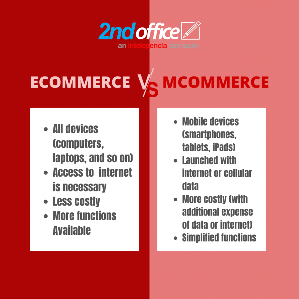
Ecommerce vs m-Commerce
What is the difference between eCommerce and m-commerce? Although the terms eCommerce and m-commerce are typically used in similar contexts, these two refer to different types of transactions. ECommerce covers all internet transactions across all devices (computers and laptops). M-commerce, on the other hand, is limited to mobile devices.
Let’s look at the table below for a better overview:
Mobile commerce for entrepreneurs and consumers
There’s no denying that mobile commerce is something to look out for, especially for business leaders who want to make the most out of the digital landscape. Aside from accessibility and mobility, mobile commerce’s potential differs depending on which side you’re coming from.
For Business Owners
Having a mobile strategy means you can immediately notify your customers of new products with a push or pop-up ads, as opposed to sending periodic emails, which translates into higher retention.
Along with advertisements, transitioning to a mobile platform allows users to shop anywhere. You’re also giving your shoppers a social function which can translate to more sales and valuable customer insights (such as buyer behaviour).
For Customers
Smartphone app functions today are incredibly intuitive. Buying patterns are observed and serve as the basis for m-commerce. These are streamlined and designed to include everything a buyer would need to make a purchase: price comparisons, customer reviews, and product information.
Mobile commerce trends we’re excited for
We see more trends as we progress through 2020, with more people relying on their handheld devices for retail therapy. The current situation opened better opportunities for brands to explore the possibility of online commerce.
Here are the mobile commerce trends we’re expected to see in 2020, based on consumer shopping data.
- On-page checkouts
Entering card details are convenient but could be improved. We’ll be seeing better on-page checkouts through digital wallets like Apple Pay and PayPal. It won’t be long before we say goodbye to credit card numbers.
- Reliable security
When you go online to your favourite shopping sites and social media pages, you’ll find that it’s easier to log on and check out because of saved data. Thanks to better security, consumers now feel more comfortable shopping and paying with a single tap.
- Mobile-first platforms
In previous years, a desktop website was the must-have for every business venturing into eCommerce. Today, we’re seeing more mobile-first initiatives as consumers transfer to handheld devices. Websites like Linktree and Carrd, which are one-page sites for mobile navigation, are climbing the eCommerce popularity ladder.
Signs that we’re moving forward with mCommerce
What are the signs that indeed, smartphones and tablets are taking over PC when it comes to e-shopping?
- Websites adjust to your screen
Desktop sites or websites that you visit on a PC used to have separate URLs to be correctly viewed on a smaller screen. Now, they are developing sites that are mobile-first responsive using HTML5. Notice that some desktop sites, like blogs and relatively new ecommerce sites, have automatically rearranging layouts to suit your browser screen.
- website UI simulates apps
Spend some time observing your favourite eCommerce sites, and you’ll notice that there are generally fewer buttons to click on (unless you want to refine your search). Also, price comparison is fully automated now. Checkout prices are automatically computed while you browse, and product reviews are almost always available. How can this experience be made even more consistent? Of course, you turn the site into an app!